Showing posts with label Portfolio finish. Show all posts

Friday, November 21, 2014

Rib Mountain State Park

 It's been a while since I've posted a large new painting. Some paintings are more difficult than others to finish. This painting, inspired from a trip to Rib Mountain State Park in Wausau, WI is one of the difficult ones.  After hiking for 2 days, and taking photos I was inspired and eager to get into the studio to paint.  I did numerous sketches, and color comps, but I wasn't happy with the planning or any of the first studies.  Those first results didn't covey how beautiful and unique the woods are, something was missing. I needed to approach it differently.  The beauty isn't just found in the perfectly shaped trees, the unique rock formations, and the intense fall colors.  It is also found in the rugged, organic trails and the diffused light.  The sunlight is softened as it is filtered through the leaves and branches; it is splashed around on the dead leaves, sticks and rocks on the ground.  I've captured that subtle light and the emotion that we experienced those 2 days of hiking.


This painting, like almost all of my landscapes doesn't depict an exact location. I'm not copying photographs, I'm trying to capture some of the beauty that I personally feel, and hopefully that resonates with others.  The real experience is never completely captured by the photos. Here are 2 that I used for inspiration and reference.  There are a few more in my earlier post.

This is the main sketch that I started with.  I compose and sketch at about 8x10, then using a grid redraw on a board prepared with gesso.

Here are 2 of the color studies.  On the left the rocks were much cooler in color, more blue. I was trying to create drama by using complimentary colors, playing the blueish rocks against the warm yellows and oranges of the leaves.  In the end I choose the softer color harmony of the warmer neutral colors in the rocks. That color scheme better captured the peacefulness of the woods.

I created a grid and blocked in the drawing with burn sienna acrylic.

Working from my color studies, I painted a first pass with oils.  After this stage I can see the direction the painting is going and adjust.

At about this point I photographed the progress and played with the black and white values in Photoshop. This helps me visualizing what I am working toward. I don't always do B&W studies as part of the process but it was helpful here.  I was trying to capture the atmosphere of the defused light.

More progress.
The finish.


Wednesday, September 24, 2014

Sedona Teapot Rock

Teapot rock in Sedona. Oil painting 18 x 30.


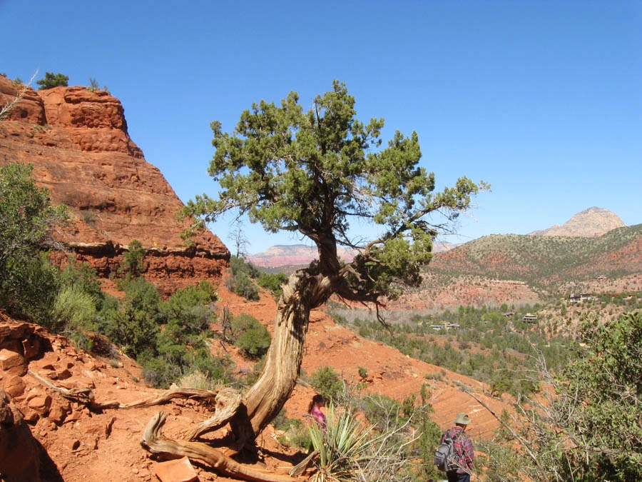
Photo reference from Sedona and the Grand Canyon South Rim.


This painting is about atmospheric perspective and depth. I wanted to balance rich saturated color with the visual space that a person experiences looking across the vistas in Sedona, Arizona. I don't always start concepts digitally, but in this case it was an advantage to play with numerous variations. Often times is difficult to nail down the right combination that captures the mood.  After all the digital experimenting I still need to paint an oil study.  Sometimes I find the study isn't inspiring enough to go on to a bigger final.  Other times the study spawns a new idea that I move onto, while still intending to comeback and at some point and paint a larger final.
This is the oil study.

The first stage working on the final, drawing and under painting in acrylic paint.
About 20 stages later, the painting is close to being final. At this stage I see design elements that can be improved.  The foreground tree shape lacks the abstract design quality originally intended.  The foreground in general appears too clean.  Although I have plenty of photo reference of places where there are large areas of bare exposed rock, it appears unnatural here. As if someone picked up all the fallen sticks and debris.
The final painting.


Wednesday, September 17, 2014

Sedona Cathedral Rock

Color study of Cathedral Rock.

Working on multiple paintings with similar subject, allows me to investigate and refine the color, design, drawing, and other elements that go into creating a painting. You'll see in the photo reference for this piece that I don't have any images with the color and mood taken on site, that I was trying to capture. Most of our hiking was late morning till late afternoon. Even if I managed to be at the right place at dawn or dusk there is no guarantee that I would see dramatic light. Besides that, photos can't reproduce the vast amount of visual information that we can see. But digital cameras allow the artist to see a small image of a photo instantly, so I'm able to analyze the photo and the reality at the same time. I then make notes of what I observe and what the camera reproduces.  What I note is not reality, but my interpretation of reality.  I'm not trying to copy the scene, I'm certainly not capable of that.  The painting is a personal representation.


 OK, so where does the mood and color idea originate?  Below are photos of dramatic light.  When I shot these I was able to study and note what I observed vs what the camera reproduced.  The exposure needed to capture the rich color in a lit sky will render the ground elements mostly black. But that's not what we see.


All of these photos were taken either on the front porch, or the back deck, of our home in Wisconsin.

Here are 2 of the digital color sketches I created as I was investigating the concept.
The final painting of Cathedral Rock in Sedona Arizona.  I now have completed 6 paintings, so far, with the similar concepts of dramatic light, and atmosphere, based on the incredible vistas of Sedona.