Wednesday, September 24, 2014

Sedona Teapot Rock

Teapot rock in Sedona. Oil painting 18 x 30.


Photo reference from Sedona and the Grand Canyon South Rim.


This painting is about atmospheric perspective and depth. I wanted to balance rich saturated color with the visual space that a person experiences looking across the vistas in Sedona, Arizona. I don't always start concepts digitally, but in this case it was an advantage to play with numerous variations. Often times is difficult to nail down the right combination that captures the mood.  After all the digital experimenting I still need to paint an oil study.  Sometimes I find the study isn't inspiring enough to go on to a bigger final.  Other times the study spawns a new idea that I move onto, while still intending to comeback and at some point and paint a larger final.
This is the oil study.

The first stage working on the final, drawing and under painting in acrylic paint.
About 20 stages later, the painting is close to being final. At this stage I see design elements that can be improved.  The foreground tree shape lacks the abstract design quality originally intended.  The foreground in general appears too clean.  Although I have plenty of photo reference of places where there are large areas of bare exposed rock, it appears unnatural here. As if someone picked up all the fallen sticks and debris.
The final painting.


Wednesday, September 17, 2014

Sedona Cathedral Rock

Color study of Cathedral Rock.

Working on multiple paintings with similar subject, allows me to investigate and refine the color, design, drawing, and other elements that go into creating a painting. You'll see in the photo reference for this piece that I don't have any images with the color and mood taken on site, that I was trying to capture. Most of our hiking was late morning till late afternoon. Even if I managed to be at the right place at dawn or dusk there is no guarantee that I would see dramatic light. Besides that, photos can't reproduce the vast amount of visual information that we can see. But digital cameras allow the artist to see a small image of a photo instantly, so I'm able to analyze the photo and the reality at the same time. I then make notes of what I observe and what the camera reproduces.  What I note is not reality, but my interpretation of reality.  I'm not trying to copy the scene, I'm certainly not capable of that.  The painting is a personal representation.


 OK, so where does the mood and color idea originate?  Below are photos of dramatic light.  When I shot these I was able to study and note what I observed vs what the camera reproduced.  The exposure needed to capture the rich color in a lit sky will render the ground elements mostly black. But that's not what we see.


All of these photos were taken either on the front porch, or the back deck, of our home in Wisconsin.

Here are 2 of the digital color sketches I created as I was investigating the concept.
The final painting of Cathedral Rock in Sedona Arizona.  I now have completed 6 paintings, so far, with the similar concepts of dramatic light, and atmosphere, based on the incredible vistas of Sedona.


Tuesday, September 9, 2014

Devils lake


Much more is needed than just a nice photo to make a successful painting.  Fortunately I don't take many good photos.  Here's an example of things I'm still learning as a painter.

Working on painting ideas, I'll do color comps in my sketchbook. Often times I believe that a particular concept will make a great painting only to change my mind once I've completed a color comp.  Here's a sketchbook example that I moved on from, at least for now. I do like the impressionism sky treatment.

Here's another one that I thought would make a good full size painting. It too would need more refinement.
Now a 3rd attempt. I felt strongly that this would be a winner.  I was motivated by the subtle variation of color in the rocks, the soft atmosphere of the overcast light with just a slight bit of fog. Not really fog, this was a cool fall late morning and the air was heavy.
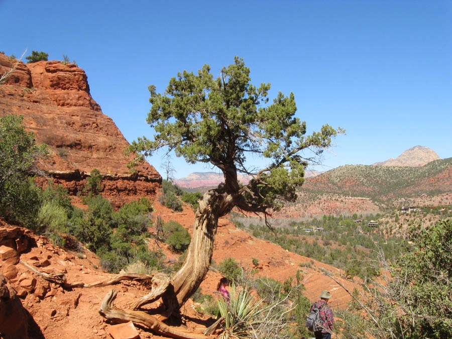
This is the photo reference. We were hiking at Devils Lake, climbing the trails up the bluff. I shot many photos that day that were inspiring.  Rarely do I base a composition so closely to one photo. Usually a painting is a combination of multiple photos and elements from imagination.
Sticking closely to the color comp and the photo, the finish came together relatively smoothly.  I had a frame to fit so we hung the painting up.  Once on the wall, I didn't like it anymore.  It took about a week of studying to decide what to do.  I felt the values were too flat.  Maybe the photo is too washed out, and I didn't address that since I liked the design of the composition so much. So I started sanding down some areas to repaint.
I sanded and repainted maybe 70%.  I started in the sky, darkening the value of the clouds, and adding the yellow light to create contrast.  Once that was done all the trees needed to be repainted darker.  With darker trees the rocks needed to be darker. Simple stuff really if everything is in layers in Photoshop, but not very simple in oil paint.  I'm happy with the final. I think my mistake was being too influenced by the photo, and not using my imagination enough.  I remember the colors being rich and dark the day we hiked. I lost that in the first attempt.  At one point in the process the rocks looked to be frosted because they were painted without those rich dark's. The next painting I conceived after this, I created about 23 color and value variations before deciding on one and moving forward.

I'm often asked how long does it take to finish a painting. That's difficult to answer. I'm not always sure when a painting is finished.  I plan to work on another painting or 2 based on the photos and what I remember from hiking that day, and also working with what I learned painting this one.


Sunday, September 7, 2014

Dragon magazine Discrection


Color comp. 6.5 x 9.5. Back in the day I painted the color comps with acrylic paint over a xerox copy of the final drawing.  Lately Ive been painting them in my sketch book with oils.

One of my favorite TSR paintings, "Discretion".